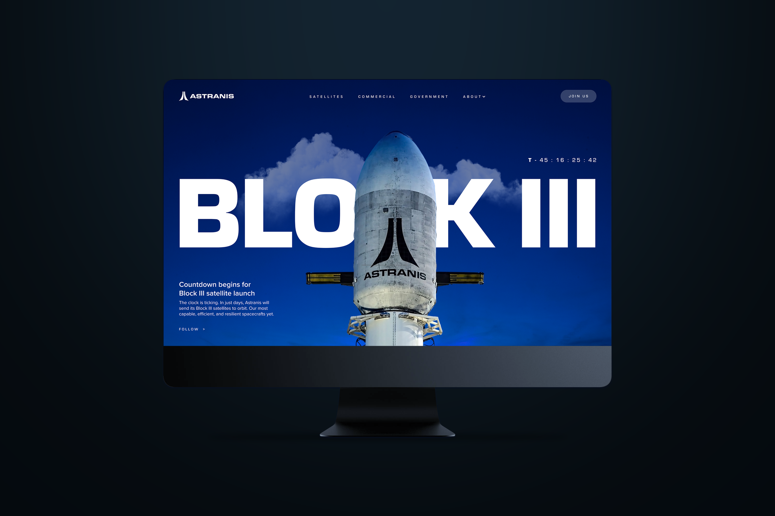
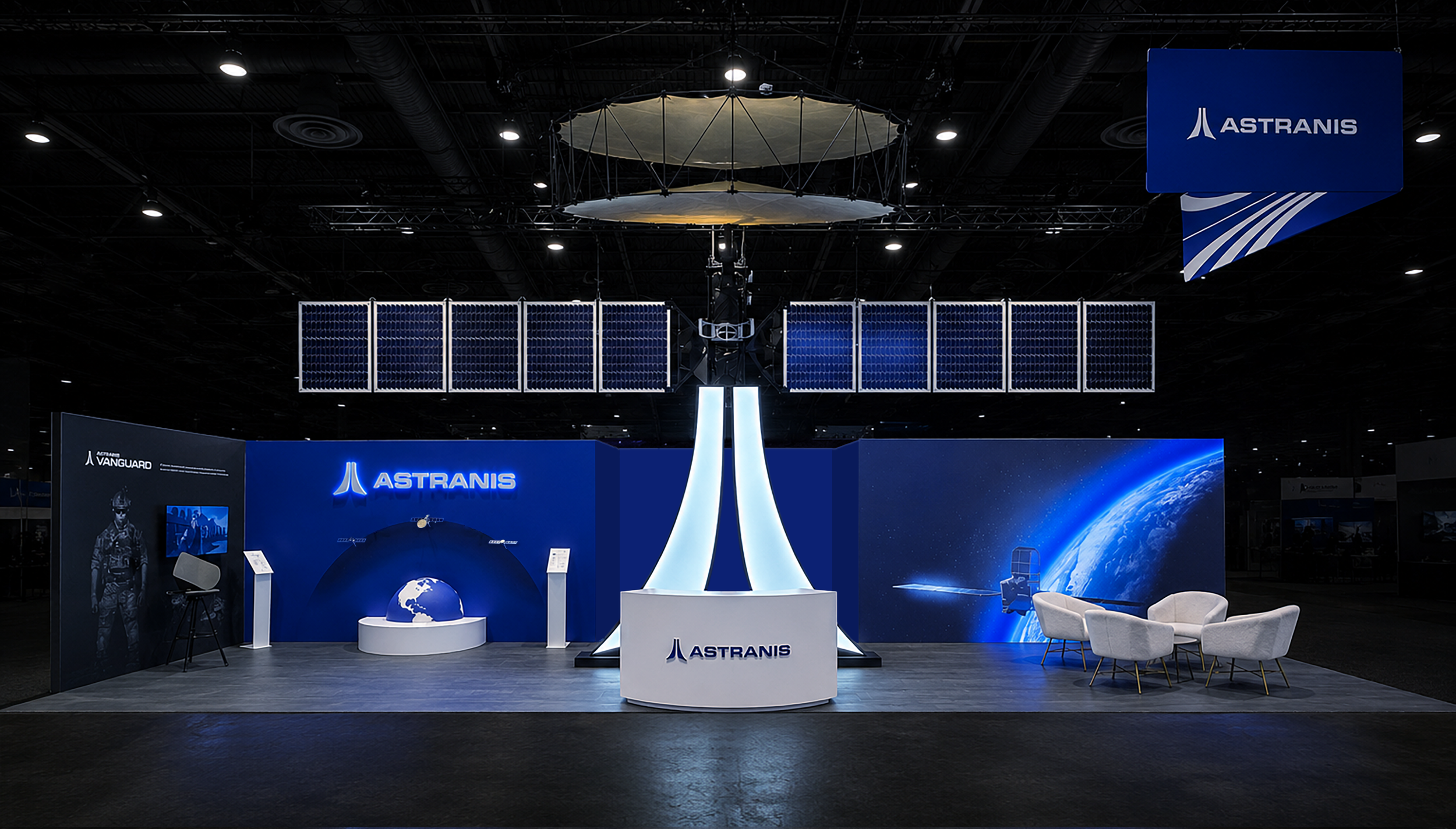
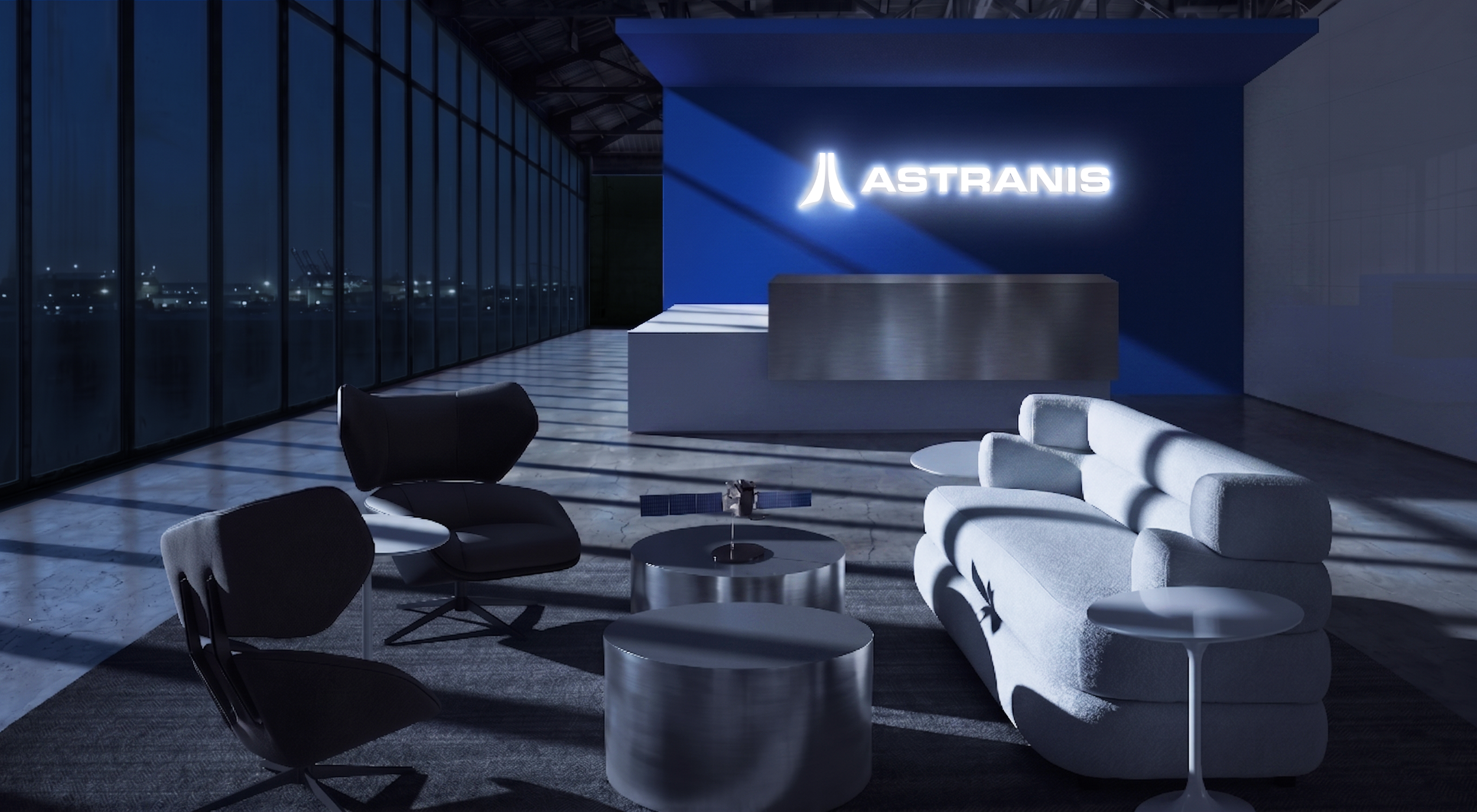
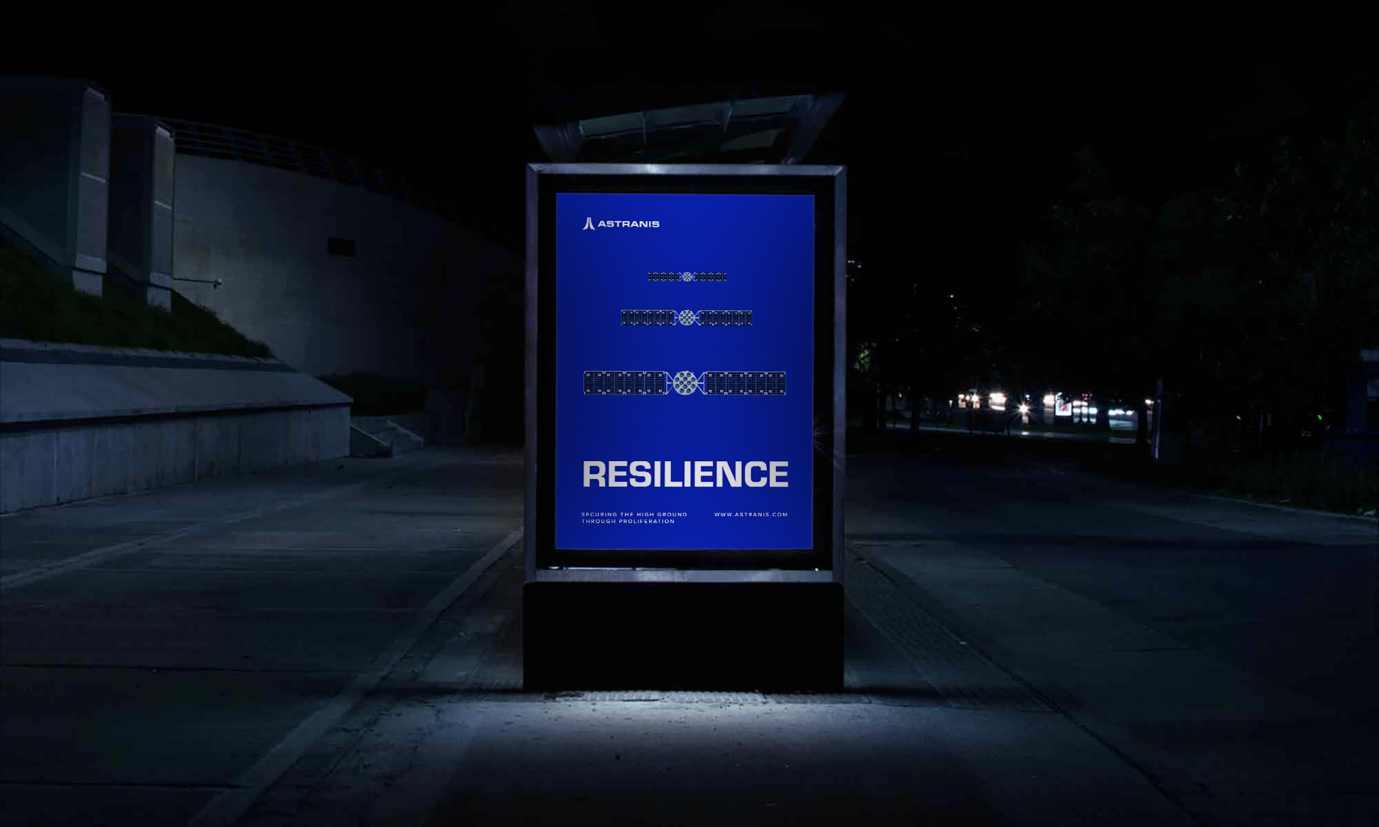
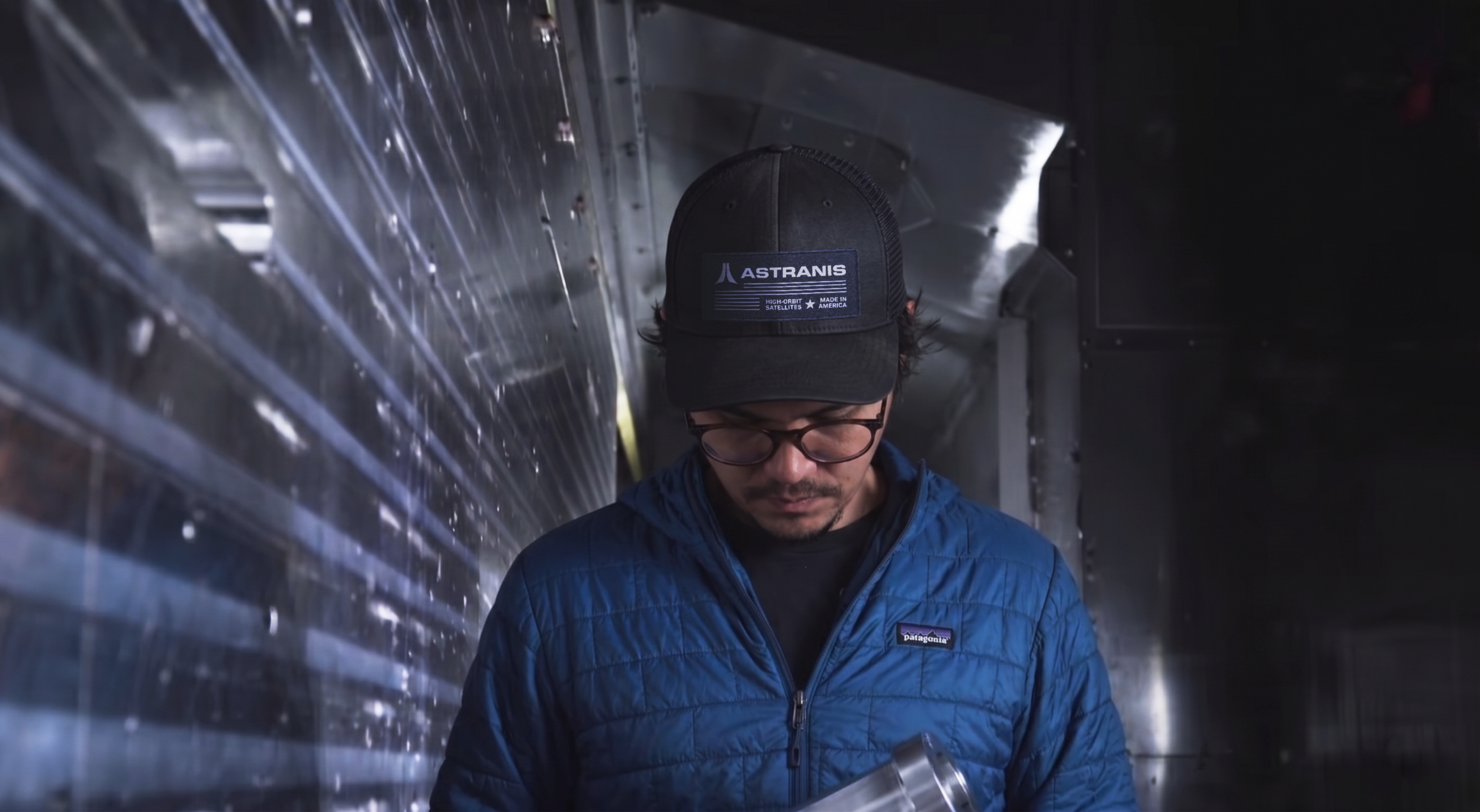
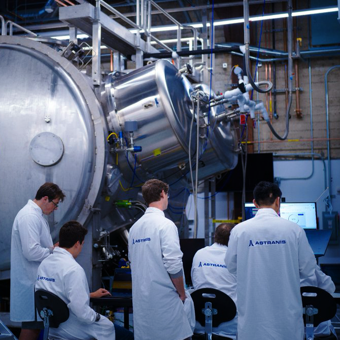
ASTRANIS BRAND
Astranis provides dedicated satellite networks for global enterprises and governments, building its spacecraft at Pier 70, a historic site that once produced World War II ships. As the company expanded its commercial reach, the brand needed to mature to match the sophistication of its engineering and the scale of its mission. As Senior Brand Designer, I led the redesign of the visual identity, developing a system shaped by aerospace precision, industrial manufacturing, and the optimism of modern American engineering. The new brand invokes the structured forms and disciplined geometry of aerospace fabrication, positioning Astranis for the next era of space infrastructure.
Role
Brand Design, Creative Direction
Team
Hayden Currie (Brand Designer, Creative Director)
Identity
The Astranis brand mark consists of two angled beams forming an abstract “A,” referencing the upward orientation of the spacecraft and the downward beams delivering connectivity to Earth. The wordmark uses Eurostile, chosen for its technical, modular forms and its historic association with NASA and midcentury futurism.


Visual Language
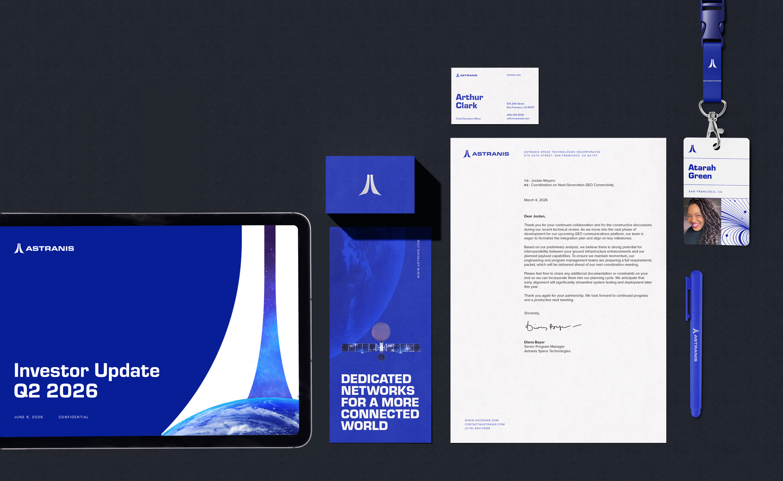
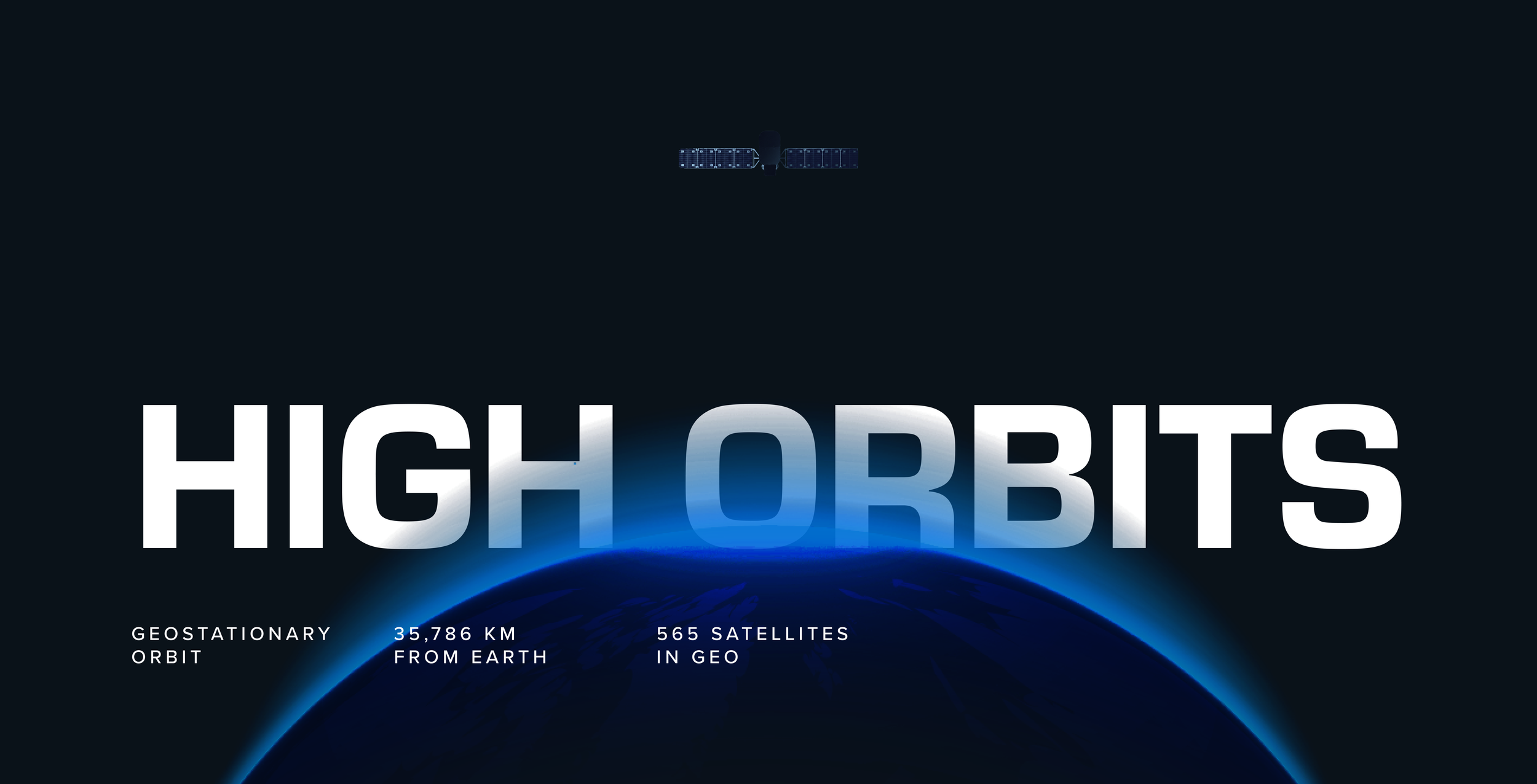
The Astranis visual system extends the identity across color, typography, and layout. The palette draws from Earth’s atmospheric glow viewed from orbit: blues, black, and white. Eurostile is paired with Proxima Nova, whose softer curves and legibility at small sizes balance Eurostile’s geometric structure. The iconography derives directly from the wordmark, using shared geometry and proportions to create a consistent, modular visual language.


Iconography
The iconography system was developed using the same underlying geometry, stroke relationships, and proportions as the logomark. Icons were designed to be highly legible while remaining simple enough to scale across interfaces, presentations, environmental graphics, and technical communications.
brand applications
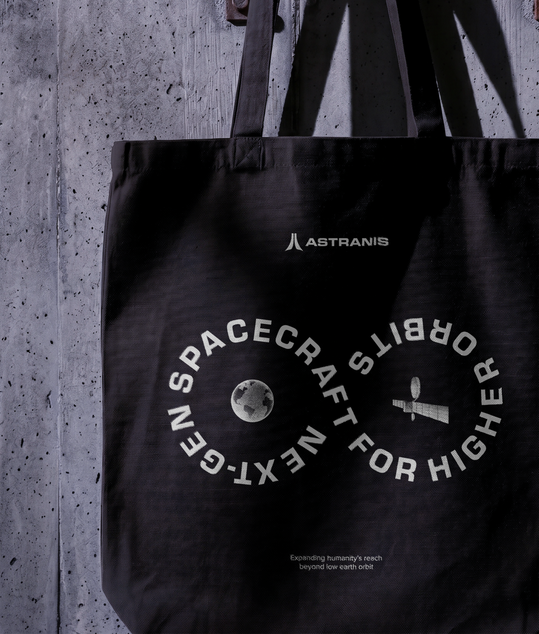
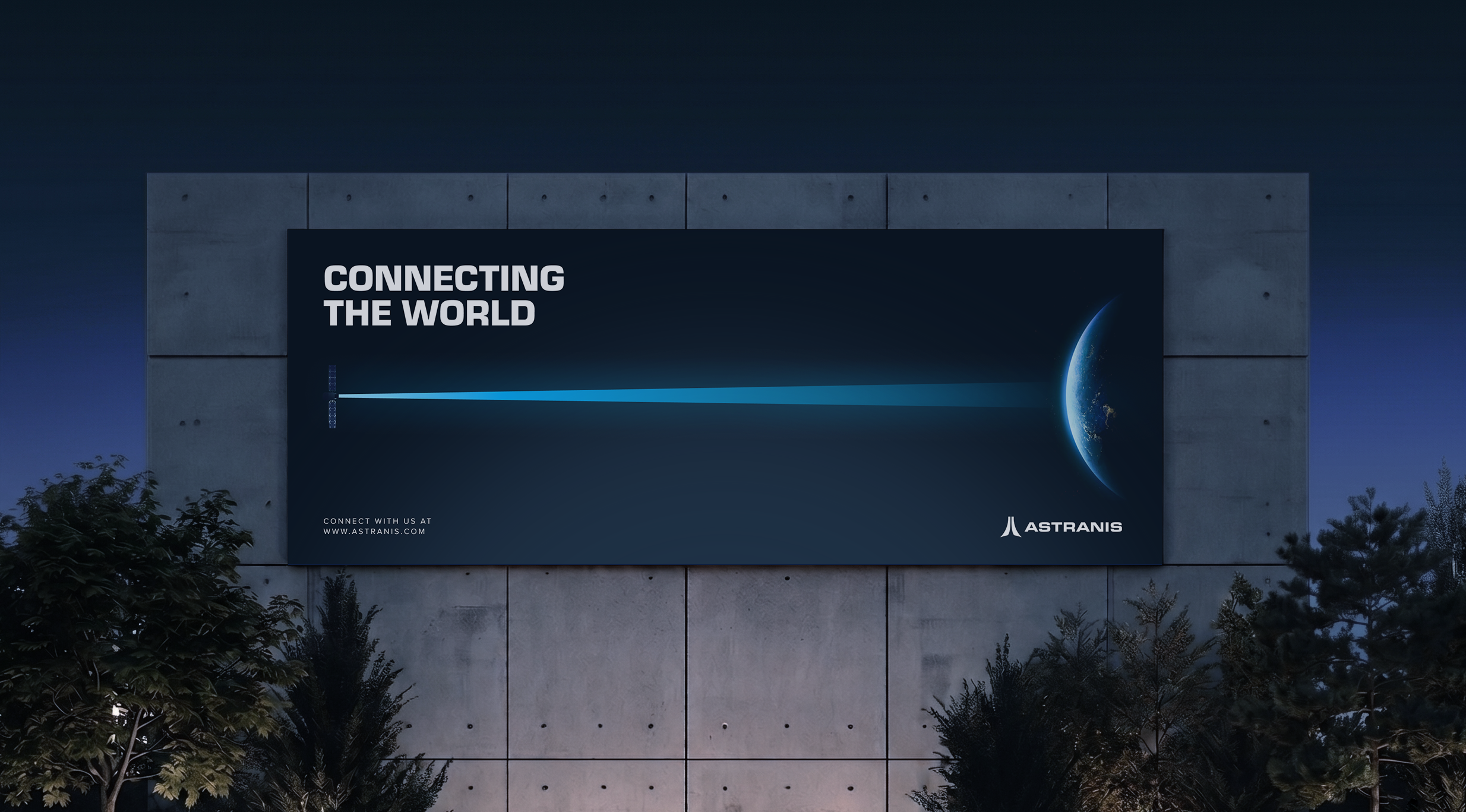
The Astranis brand language is inspired by industrial design and retrofuturist references from early American spaceflight.