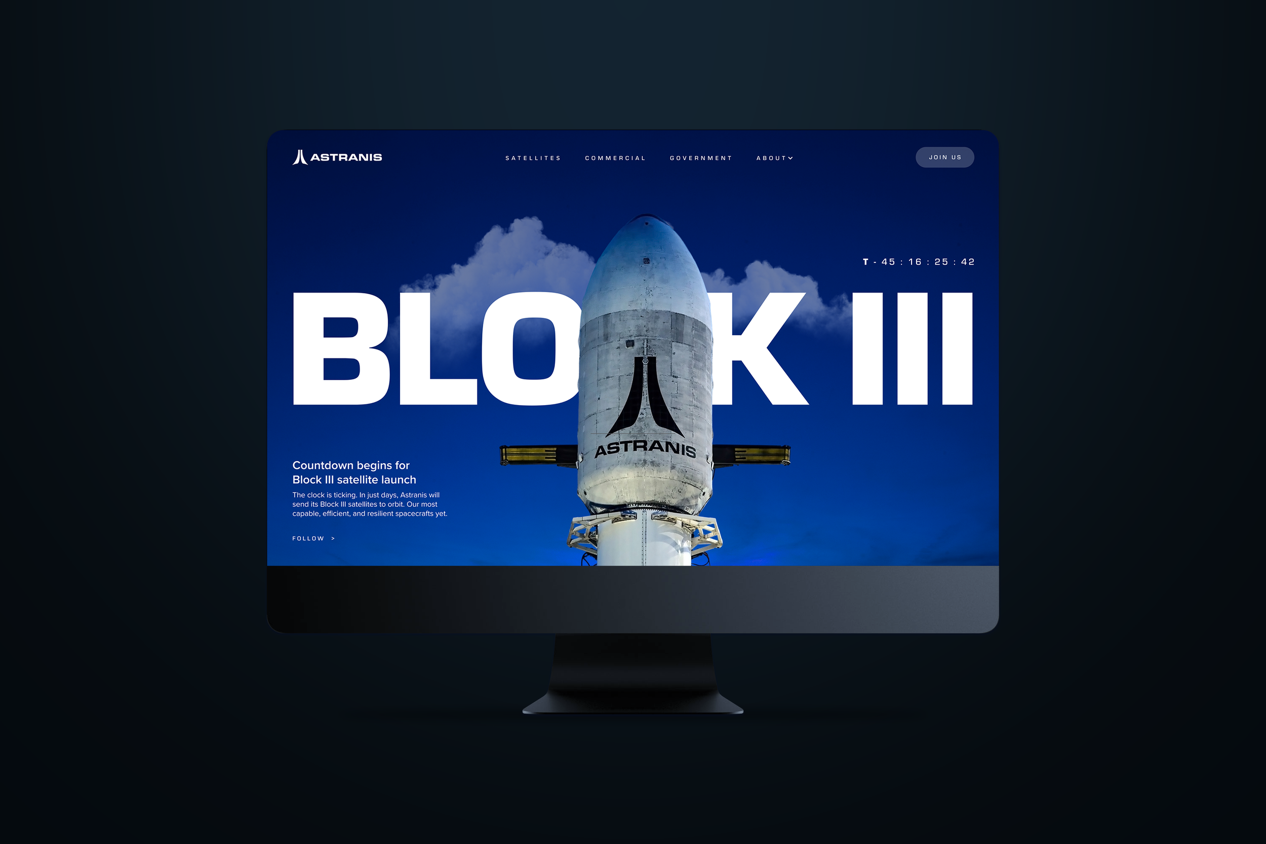
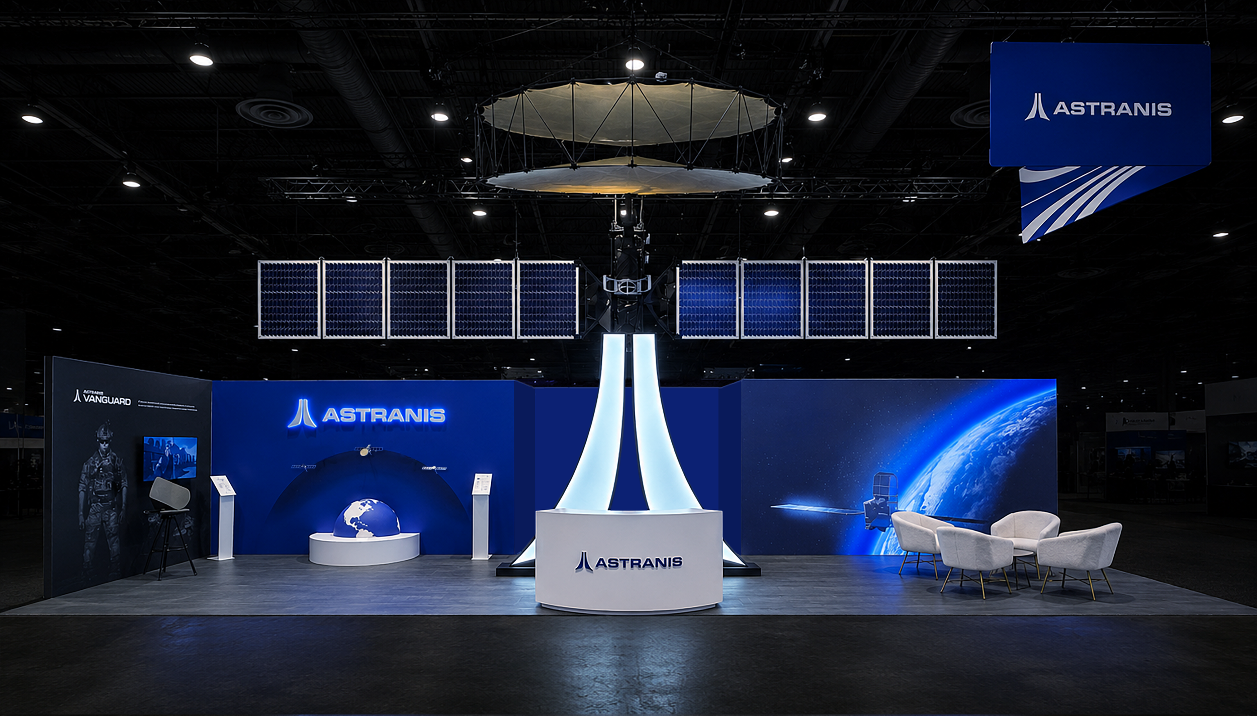
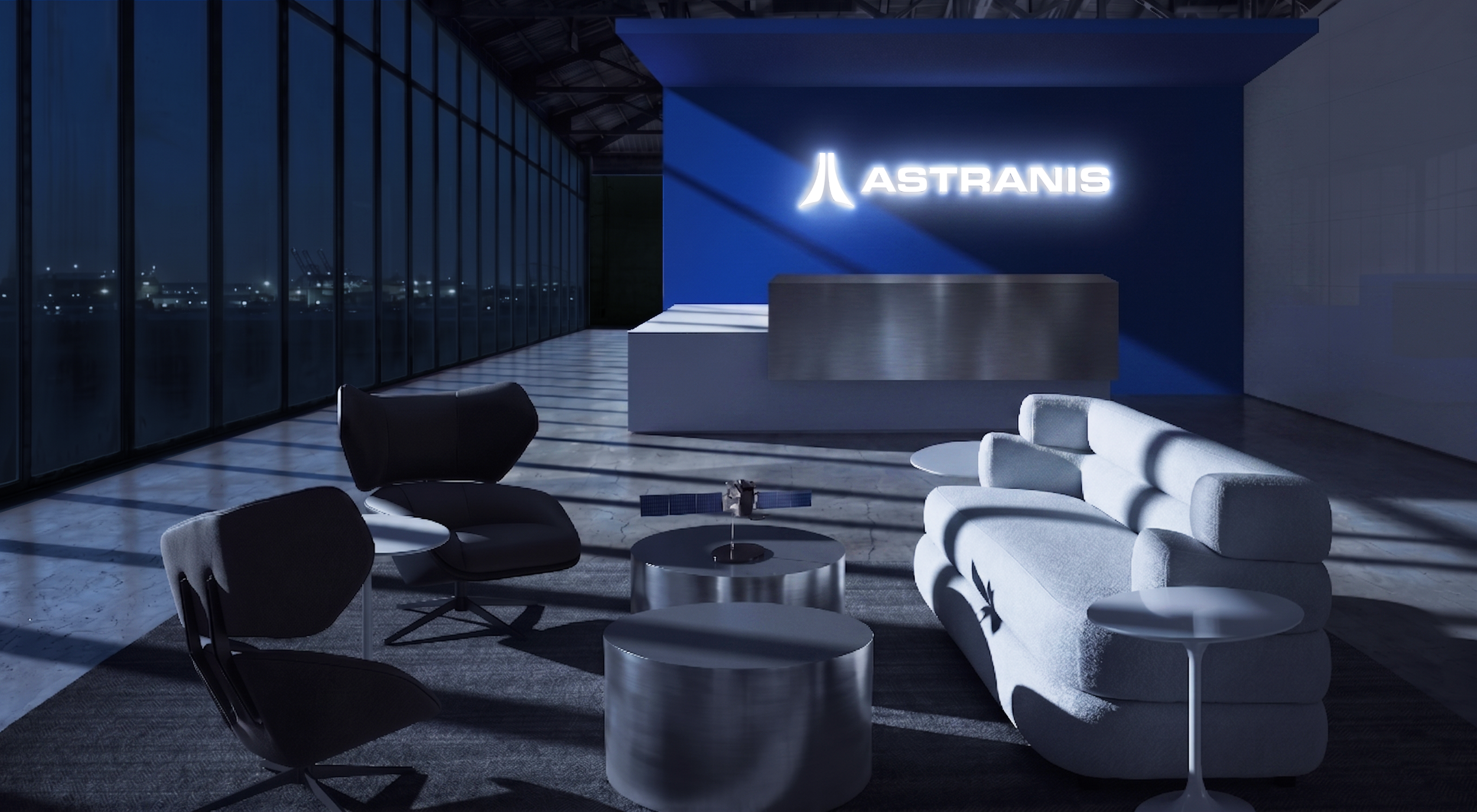
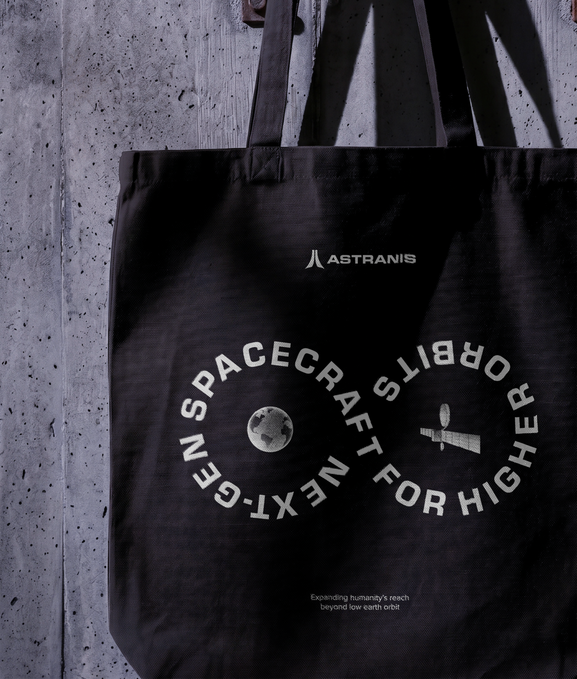
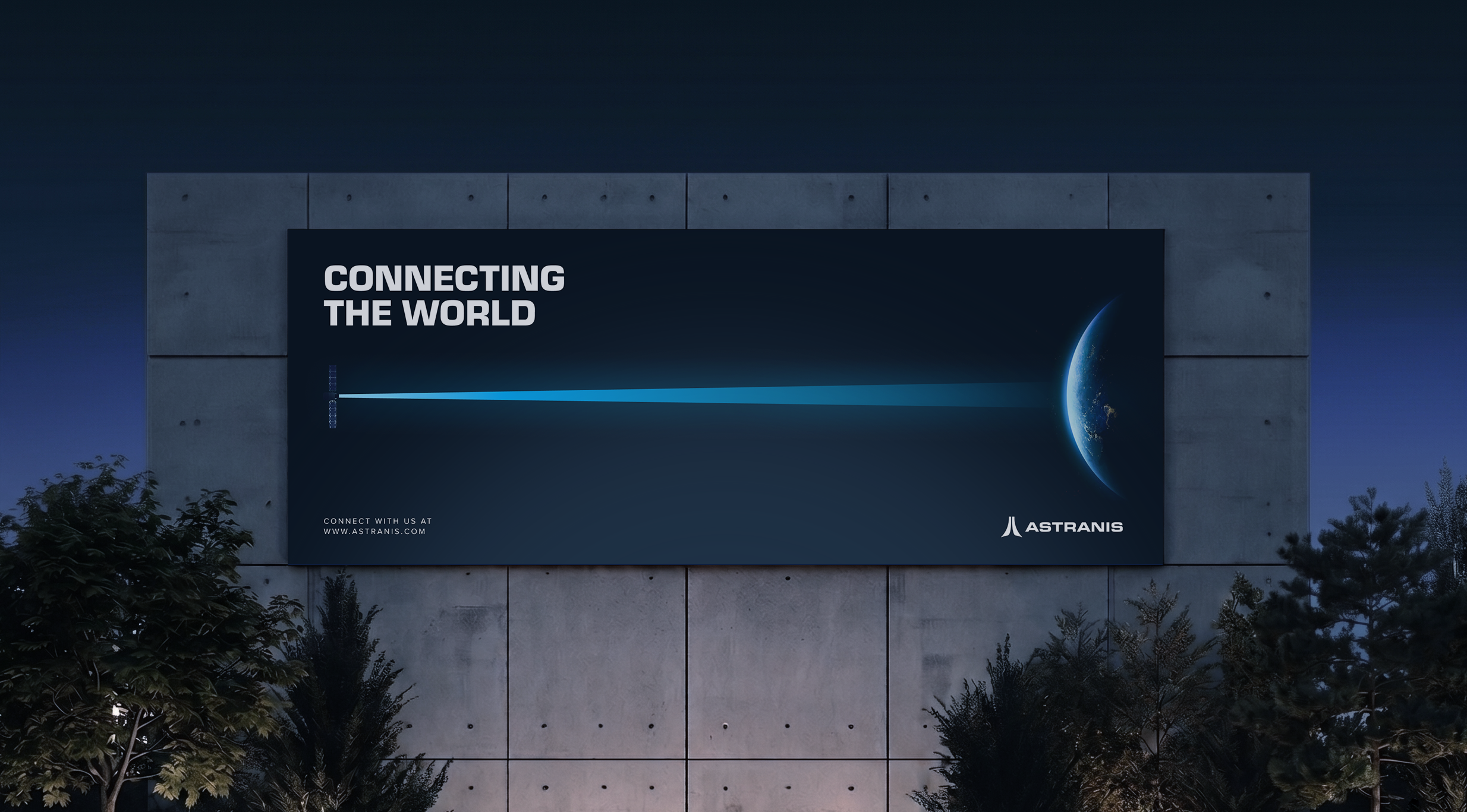
ASTRANIS ILLUSTRATION SYSTEM
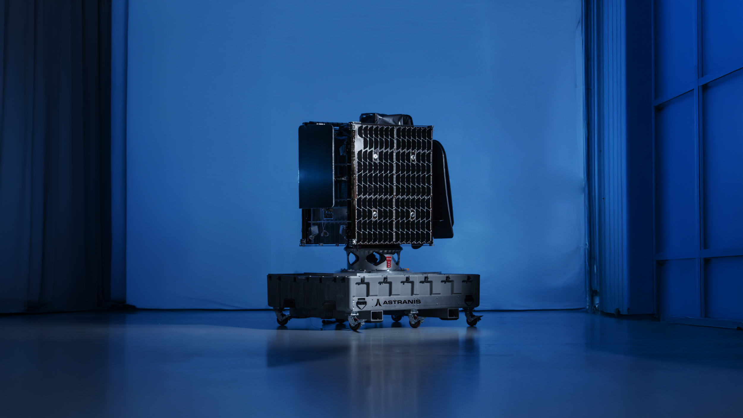
Astranis needed a cohesive illustration system to establish a recognizable and differentiated visual identity as the company scaled across product, marketing, and communications. Its existing visuals relied heavily on satellite renders, a common approach among aerospace companies. The system draws from mid-century modern and space-age industrial illustration, building a visual language rooted in the optimism and ambition of the space race era. The illustrations established a distinct visual identity within the aerospace category and increased interest from external audiences and potential partners.
Role
Illustration, Brand Design, Creative Direction
Team
Hayden Currie (Brand Designer, Illustrator, Creative Director)
Identity
The Astranis brand mark consists of two angled beams forming an abstract “A,” referencing the upward orientation of the spacecraft and the downward beams delivering connectivity to Earth. The wordmark uses Eurostile, chosen for its technical, modular forms and its historic association with NASA and midcentury futurism.


Visual Language
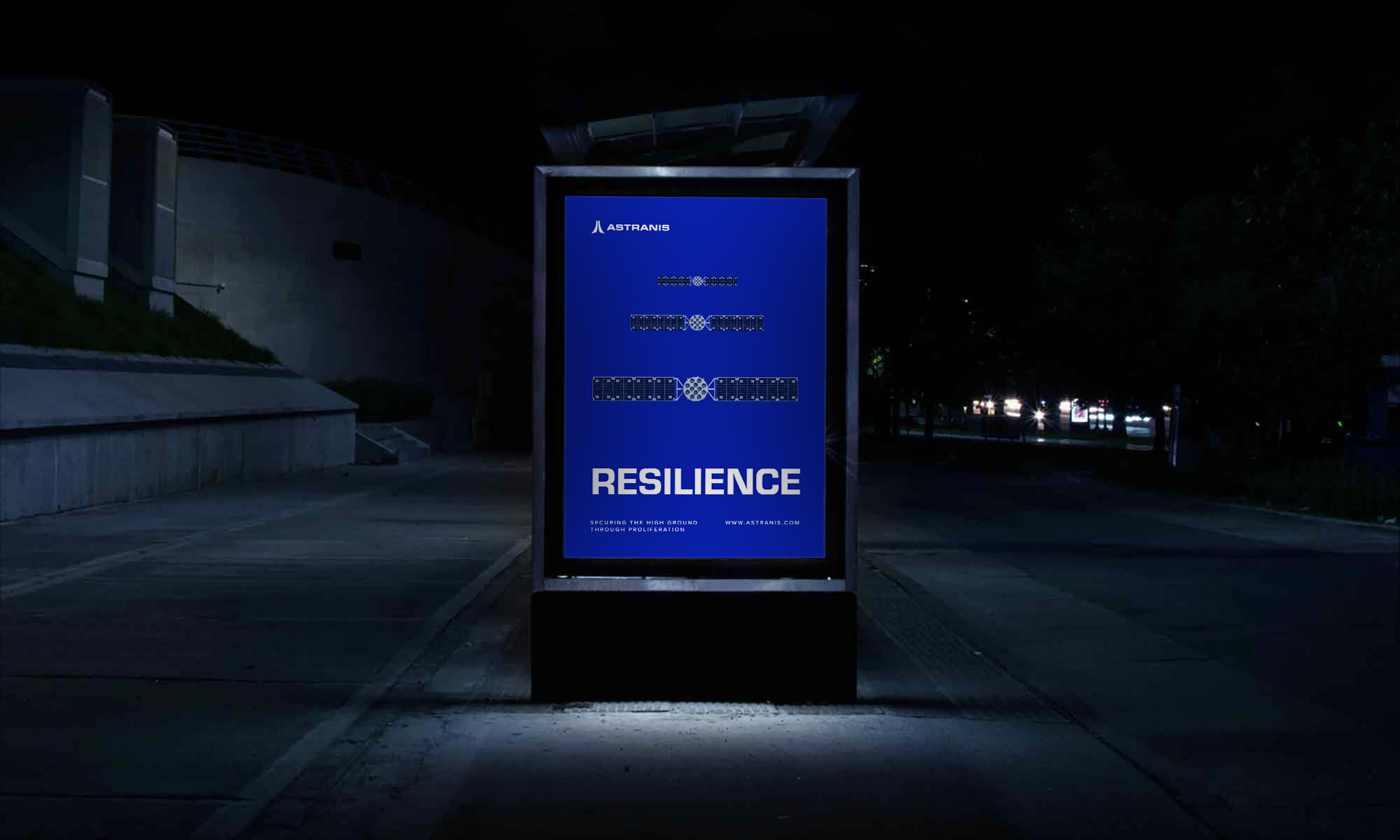
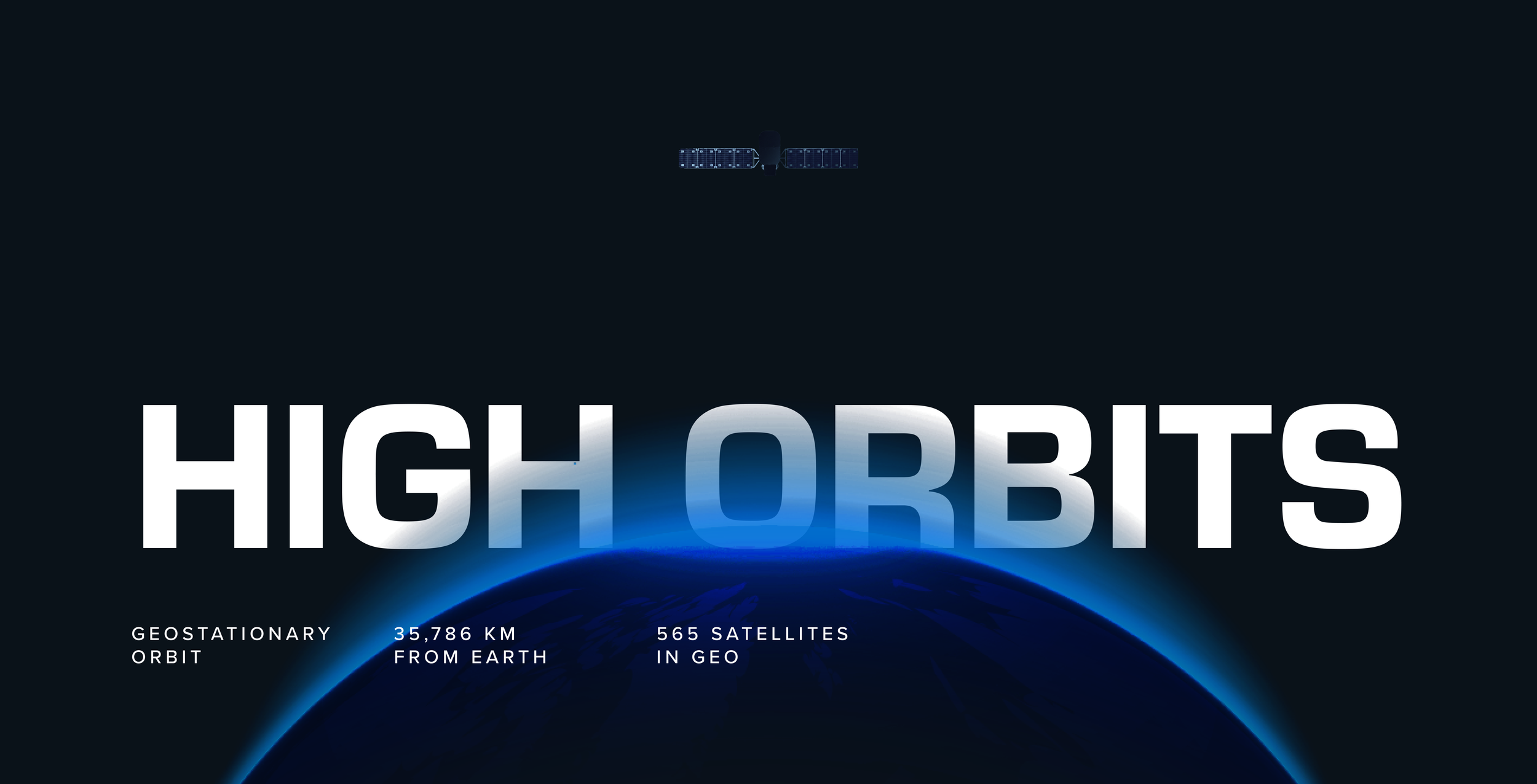
The Astranis visual system extends the identity across color, typography, and layout. The palette draws from Earth’s atmospheric glow viewed from orbit: blues, black, and white. Eurostile is paired with Proxima Nova, whose softer curves and legibility at small sizes balance Eurostile’s geometric structure. The iconography derives directly from the wordmark, using shared geometry and proportions to create a consistent, modular visual language.


Iconography
The iconography system was developed using the same underlying geometry, stroke relationships, and proportions as the logomark. Icons were designed to be highly legible while remaining simple enough to scale across interfaces, presentations, environmental graphics, and technical communications.
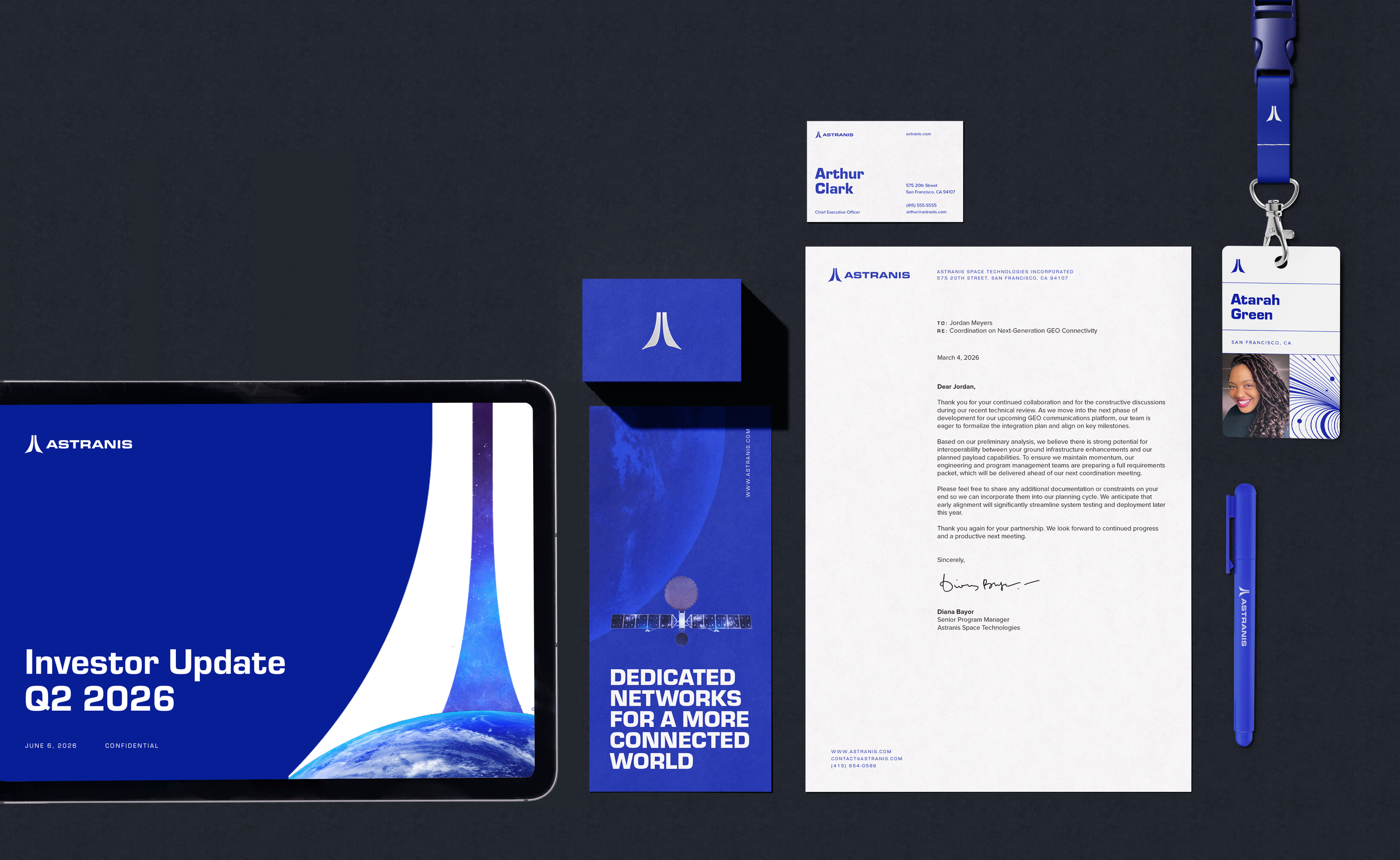
brand applications
The Astranis brand language is inspired by industrial design and retrofuturist references from early American spaceflight.